


 Credit: Raising Cane’s
 Credit: Raising Cane’s


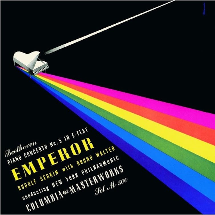
This month marks 50 years since the release of The Dark Side of the Moon. Pink Floyd’s eighth studio album beamed the band into super stardom with platinum-selling singles such as Money and The Great Gig in the Sky.
Typifying Pink Floyd’s mix of philosophical lyricism and spaced-out rock sound, the record sits comfortably in the top 50 best-selling albums of all time. It is also frequently called one of the greatest albums of all time by popular music magazines such as Rolling Stone and NME.
The iconic album cover, produced by Storm Thorgerson’s legendary design agency Hipgnosis, is a seminal reference point in pop culture and modern art. Unsurprisingly, it makes for a popular band t-shirt design and figures consistently and prominently on “best album cover” lists.
The image of the enigmatic prism reflecting beams of light into deep space parallels the band’s complex sound world and their lyrical interplay between science and mysticism.
There are several interpretations of the cover art’s meaning. Some fans have suggested that it works as a metaphor for personal and psychological darkness, while others maintain that the prism in particular represents intellectual thought and ambition.
But this wasn’t the first time the image of the rainbow and prism had inspired album artwork. A similar cover was created by New York-born Alex Steinweiss 30 years before The Dark Side of the Moon. The graphic designer is generally recognised as the “inventor” of album cover art as we know it.
Steinweiss’ revolutionary design
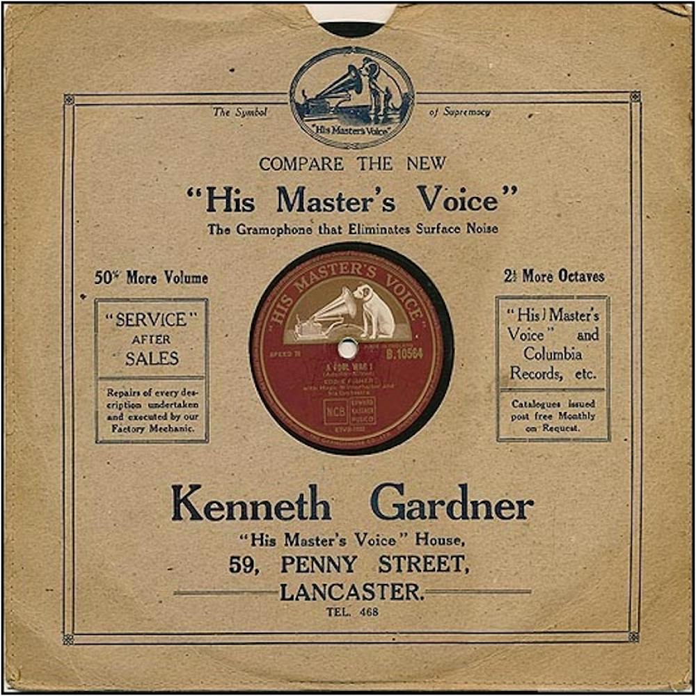
As the in-house designer for Columbia Masterworks, Steinweiss produced over 2,000 bespoke artworks. It was later reported that his album covers helped boost sales and increase the label’s profits. One such artwork accompanied Rudolf Serkin, Bruno Walter and the New York Philharmonic’s 1941 recording of Beethoven’s Piano Concerto No. 5.
Archive.org
This cover is noteworthy in that it subverted the tradition of insipid grey and tan Kraft paper sleeves that offered only the essentials, such as the record company name and details of the stores in which the recordings were sold.
Indeed, the uninspiring packaging for these 78rpm shellac discs was among the reasons the pseudonym “tombstones” came about – the way these recordings were referred to in the trade.
Steinweiss’ Beethoven artwork was part of a marketing revolution that in part defined mid 20th-century graphic design.
The sleeve’s central motif is a white piano, set against a midnight black backdrop, into which a white beam of light shoots. Emerging from the other side of the piano are six multicoloured beams that span the length of the sleeve. This combination of images could be interpreted as a metaphor for the artist’s composition and performance process. Inspiration strikes the composer and out of the piano arrives a magnificent and colourful array of sounds.
Art Album Exchange
At first glance, the resemblance between this and The Dark Side of the Moon’s artwork is remarkable. In fact, the only substantial differences are the object through which the light is reflected and the printed text. Nevertheless, there is no evidence to suggest that Hipgnosis drew inspiration from, or even knew about, Steinweiss’ cover art.
Rather, it is documented that Aubrey Powell (Storm Thorgerson’s collaborator and co-founder of Hipgnosis) happened upon a photograph in a French physics textbook, which used a glass paperweight to demonstrate the principles of refraction.
The image of a prism reflecting a rainbow of light worked with Pink Floyd’s request for a bold and dramatic design. In addition, Thorgerson claims that the artwork served as an homage to the impressive light show that had become an integral part of Pink Floyd’s live performances.
So the hidden resemblance between these two legendary cover artworks isn’t a case of copy and paste. It speaks to a broader phenomenon – the bespoke sleeve design revolution that turned music marketing strategies on its head.